
##Meta Refresh 2015 edition: The web in your pocket
##Theme
We’re already in a world where smartphones outnumber all the desktops and laptops put together. A sizeable portion of your existing user base could be accessing your website only through a handheld device. It is quite likely that future web users will never experience a site on a large screen.
Undeniably mobiles, be it phones or tablets, have become a critical channel for user acquisition and customer engagement. In fact, one can argue that mobiles are already the primary touch-point for reaching and experiencing the web in many cases.
For many web designers and developers, however, the constraints of a mobile device continue to be a beast — small screen, low resources, fickle networks and the (often false) assumption that the user is always on the move with limited time at hand.
Responsive design hasn’t been enough. Mobile-first was just a start. It takes a lot more to tame the beast and to create a great browsing experience for a mobile user.
Meta Refresh 2015 will focus on enhancing web experience on mobile devices.
We’re looking forward to proposals about:
- Evolution of web design in your organisation: what is the context of your business and customers? Why and how did you evolve your UX strategy and practice for mobile devices?
- In your experience and practice, how does the context of mobile user influence the design of your websites? How does the behavior of users accessing web through a mobile differ?
- How do you take complex web applications beyond the desktop? Speak to us from your experience.
- What are the common misconceptions / incorrect assumptions about the mobile context? How did you figure these in your practice?
- How do you design content for mobile websites? What kind of detailing is involved here?
And oh, if you disagree with the theme, we’d like to hear about that as well.
We are accepting proposals under the following sections:
- Design process outlining concrete steps.
- Mobile website strategy.
- Content design.
- Design patterns.
- User research and insights.
- Performance and front-end tools – crisp talks only.
- Maintainability challenges.
Commitment to Open Source
HasGeek believes in open source as the binding force of our community. If you are describing a codebase for developers to work with, we’d like it to be available under a permissive open source license. If your software is commercially licensed or available under a combination of commercial and restrictive open source licenses (such as the various forms of the GPL), please consider picking up a sponsorship. We recognize that there are valid reasons for commercial licensing, but ask that you support us in return for giving you an audience. Your session will be marked on the schedule as a sponsored session.
Format
The 2015 edition is a two-day single-track conference – 16 and 17 April. We invite proposals for:
- Full-length 40 minute talks
- A crisp 15-minute presentation
- Sponsored sessions, 40 minute duration
Criteria to submit conference proposals
You must be a practising web developer or designer, and must be able to show how your own work has advanced the state of the web in the past year. You are expected to present original work that your peers — this event’s audience — recognise as being notable enough to deserve a stage.
If you are excited about someone’s work and believe it deserves wider recognition, we recommend you contact them and ask them to submit a proposal.
##Workshop proposals
If you are interested in teaching, sharing knowledge with the community and/or conducting professional trainings on CSS, front-end engineering and design, submit a proposal under workshop section. Specify past experience in teaching and conducting workshops. Even better if you share links to videos of workshops where you were an instructor.
We’ll host workshops starting October 2014 until April 2015.
###Buy tickets here: https://in.explara.com/e/meta-refresh
Videos
See all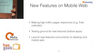
Mobile's Stepchild - A Cleartrip Experience
Wishy Arora
33 minutes17 April 2015
DOM animations, almost native
Arun Subramaniam
18 minutes17 April 2015
Venue
MLR Convention Centre, JP Nagar
Hosted by
Meta Refresh is an umbrella forum for conversations about different aspects of design and product including: UX and interaction design CMS, content management, publishing and content marketing Information architecture
more